A New Tool for Seeing HF Conditions in Real Time

I’ve been experimenting with a new tool that visualizes HF propagation in real time using live data from multiple networks — WSPRnet, Reverse Beacon Network, PSK Reporter, and various DX Clusters.

The result is dxlook.com, a site designed to give amateur radio operators a visual feel for current band conditions. You can filter by band (10m–160m), mode (Digital, CW, SSB), and perspective grid (your QTH), and it builds a live propagation heatmap around that location.

The site offers a few different ways to look at things:

  • Summary View shows signal activity aggregated by grid square — a quick glance at where things are happening.

  • Cluster View centers everything around your location (or any 4-character grid you choose) so you can see where signals are going to and from in your area.

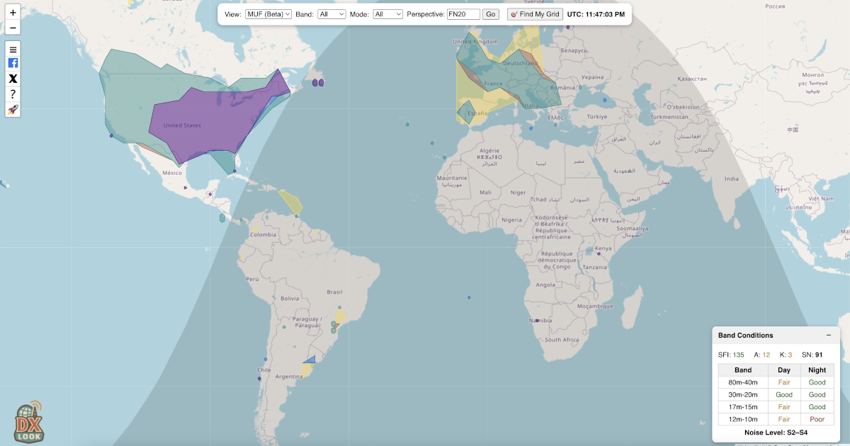
  • MUF View (still in beta) estimates maximum usable frequency zones based on actual reported paths — a dynamic take on real-time band openings.

There’s also a compact Band Conditions widget that pulls in solar data (SFI, A/K, SN) and gives a per-band outlook (Good/Fair/Poor) based on time of day. Plus, a handy “Find My Grid” button makes it easy to auto-locate your current grid square without needing to look it up.

It’s built by a ham (me — AK6FP) and is completely free to use — no accounts, no distractions. Just open it and explore. I’m actively improving the site based on community feedback, so if you have ideas, I’d love to hear them.

Feel free to check it out and let me know what you think: dxlook.com

I tried it out and it works nicely. The fact it says poor or fair for my location rather explains things I think.

2 Likes

Since I wrote the original post, DXLook has evolved a lot, and the platform now provides several new views, features, and improvements based directly on user feedback.

:fire: New Views & Capabilities

• Reports View
Shows individual live reception reports from WSPRnet, RBN, PSK Reporter, and DX Cluster — all unified in one timeline-style map. Each spot includes frequency, mode, SNR, and origin/destination grids.

• Realtime View (brand new!)
Connects directly to PSK Reporter’s MQTT live feed, so FT8/FT4/WSPR reports appear instantly on the map, even faster than PSK Reporter’s own site.

• POTA View
Displays real-time Parks on the Air activations with activator paths, park info, and great-circle arcs — perfect for hunters.

• QSO View
Upload your own ADIF file to visualize your contacts on the map, with filtering by band and mode plus optional arc lines.

• Improved MUF View
Now uses midpoint-based geometry, real HF paths, zone smoothing, and better filtering to represent real MUF openings more accurately.

:star: Personalized Band Conditions (new)

DXLook now generates band condition predictions tailored specifically to your grid square .

Instead of using generic “global” band ratings, DXLook analyzes:

  • Real-time reports originating from or arriving into your grid
  • Local noise levels inferred from SNR patterns
  • Time-of-day and solar indices (SFI, A, K, SN)
  • Expected MUF at your latitude, not globally

The result is a localized rating per band (Good / Fair / Poor) that reflects your actual operating conditions, not an averaged or model-based estimate.

This feature is especially helpful for understanding why a band may appear “dead globally” but is actually open from your location, or vice versa.

DXLook has grown a lot thanks to the community’s suggestions, so if you have ideas or run into anything unexpected, I’d really appreciate the feedback.

73,
Rodrigo – AK6FP

Good morning. Thank you for this precious tool.

Personally, I find it extremely difficult to understand if propagation is actually open or not, especially for SSB.

First: Selecting just one grid usually doesn’t give me enough results in SSB and CW, so I end up relying only on digital modes. Is there any possibility to select more grids at the same time, or maybe a small cluster of grids around mine?

Second: Tools like DXView show a band as “open” just because someone with huge antennas and 1500 W manages to get through. Most ham radio operators don’t work like that, and these maps (DXLook as well) should allow filtering to remove these exceptions. There are many ways to do this: many big-gun stations are well-known, or there could be an option to hide signals above a certain power level, or simply exclude specific stations. Sometimes antennas setup are known as well. The same problem exists with digital modes, where I get a ton of negative SNR reports that are completely useless when I want to judge SSB propagation. PSKReporter has a “hide faint monitors” option, but without the ability to set a minimum SNR, it’s not very helpful.

Third: It would be nice to have a simple guideline on how to interpret when propagation is open for each mode category. SSB, CW, and digital modes behave very differently, and it would help a lot to have something clear to refer to.

Have a nice day:)

Also, would be good to understand why there is discrepancy compared to hf.dxview.org when this last one has the same (but less) sources and shows more points in the map (when it should eventually be the opposite). Their software error or maybe dxlook is not considering all the present data. Please check.

As setting I have grid JN61 - sent/received by - last 15 mins 14mhz.

From hf.dxview.org :
Data for the map is gathered from several online sources: WSPRnet, Reverse Beacon Network (CW, FT4, FT8), and DX Cluster. Some of these sources provide [signal-to-noise ratio (SNR)]) information.

SNR can be used to determine if a particular path supports certain modes like [morse code (CW) or single sideband (SSB).

The map indicates SNR levels with three different per-band shades: SSB (SNR > 10), CW (SNR > -1), or digital modes(which can decode down to an SNR of about -28).

Hi Larry,

Hi — thank you very much for the detailed and thoughtful feedback. I really appreciate the time you took to analyze how the tool behaves in real operating conditions. Let me address your points one by one and clarify how DXLook currently works, as well as its limitations.


1) Big-gun stations, power levels, antennas, and unrealistic “open band” interpretation

You are absolutely right: a single station running high power and large antennas can make a band look “open” when, in practice, that opening is not usable by the average operator. This is a known and very real problem for all propagation visualization tools.

At the moment, DXLook does not apply any power-based or antenna-based filtering , mainly because:

  • Transmit power is not reliably reported in most networks (and is often missing or incorrect).
  • Antenna type is almost never available as structured data.
  • Many stations that behave like “big guns” cannot be consistently identified across all networks.

That said, your concern is 100% valid. What can be done reliably — and what I have just implemented based directly on your and others’ feedback — is SNR-based mode interpretation, which already removes a very large portion of misleading data for SSB.


2) Digital SNR vs real SSB/CW usability — major backend change already applied

This is probably the most important point in your message, and I completely agree with you.

Based on your observations, I have now implemented SNR-based mode augmentation across DXLook:

  • SSB: SNR ≥ 10 dB
  • CW: SNR ≥ –5 dB
  • Digital: SNR < –5 dB

What this means in practice is:

  • Even if a spot comes from PSK Reporter, it can now be interpreted as SSB-capable or CW-capable if the SNR is high enough.
  • This dramatically improves SSB and CW visibility, which previously looked empty simply because most spotting data today comes from digital modes.
  • This logic is now applied consistently in:
    • Summary
    • Cluster
    • MUF

3) Clear interpretation guidelines for SSB / CW / Digital

You are absolutely right here too. Even with better filtering, a visual map alone is not enough without interpretation guidance.

SSB, CW, and Digital:

  • Behave very differently,
  • Tolerate very different SNR thresholds,
  • And require very different conditions to be considered “open.”

On DXLook we already have several blog articles that explain:

  • How MUF works,
  • How the different views (Summary, Cluster, MUF, Realtime, etc.) should be interpreted,
  • How Personalized Band Conditions are calculated based on your grid, geomagnetic latitude, time of day, and space weather.

You can find those on our blog (I cannot insert links :frowning: here)

However — and this is an important point — while those articles explain how the system works, there is currently no single, simple “mode-by-mode cheat sheet” that explicitly says:

  • “For SSB you generally want at least X dB SNR,”
  • “For CW you can expect readability starting around Y dB,”
  • “For Digital you can decode far below voice usability,”
  • Or how to combine MUF + SNR + real paths into a practical “is it worth calling now?” decision.

I fully agree that such a simple, practical guideline would be extremely useful, and I do plan to add this as a dedicated reference article to DXLook’s documentation. This is an excellent suggestion.


4) Discrepancy between DXLook and dxview.

This is an important point, and I want to be completely transparent here:

I do not know exactly how dxview processes, filters, weights, or augments its data internally.

And this is exactly the original reason why I built DXLook in the first place.

I wanted:

  • Full control over every filter,
  • Full visibility over every transformation step,
  • No black-box heuristics,
  • No blind trust in what a colored map “suggests.”

DXView publicly states that it:

  • Uses WSPRnet, RBN, and DX Cluster,
  • Applies SNR thresholds for SSB (SNR > 10), CW (SNR > –1), and Digital (down to –28).

But there is no full public documentation of their internal logic regarding:

  • Exact time windows,
  • De-duplication rules,
  • Path weighting,
  • Multi-source merging behavior,
  • Outlier handling,
  • Or any possible reputation filtering of stations.

Because of that, when DXView shows more points, it could be due to:

  • Different time windows,
  • Less strict filtering,
  • Different data merging strategies,
  • Or simply duplicated overlapping data from multiple sources.

Without access to their internal processing rules, it is technically impossible for me to guarantee 1:1 visual parity, and I prefer to be honest about that rather than speculate.


Once again, thank you for the high-quality feedback — this is exactly the kind of input that genuinely improves the platform.

73,
Rodrigo - AK6FP

Thank you very much AK6FP.
Please note that there is a potential time gap in the MUF section between all bands and a single one as 14mhz for SSB. I always see new MUF zones appearing when I select one band (20m) and just after several minutes they appear in the all bands section too (if they appear).
You can also note a difference in the zone dimensions (not caused by an agglomeration of higher MUF zones)
It would be great if they were both modalities updated at the same time/dimensions to have consistency.


You can see a missing 14mhz zone under the Michigan lake and a different covered zone by the second triangle under it + Cuba.

Best regards

Hi Larry:

you’re seeing the cache in action :slightly_smiling_face:

The MUF view is cached for 5 minutes because it’s a heavy calculation (thousands of spots, SNR filters, polygons, the whole thing). The 20m-only view you opened right after was a fresh calculation, so it already included newer PSK Reporter data.

That’s why the Michigan zone shows up in one view and not the other — about 40 seconds of new data landed in between.

Without caching, every change would take several seconds and hammer the server. With caching:

  • Most views load instantly
  • The data is still very fresh (max 5 min old)
  • The system stays fast for everyone

So yep — what you noticed is normal and actually confirms everything is working as expected.

Thanks for the sharp eye! :satellite_antenna: 73!

Good evening again, thank you for your explanation, really precious.

  • I checked it again live with a colleague for 20 minutes in a row and unfortunately we noticed that even after all this time, on the MUF page, there are more spots selecting just one band (20m but we also checked 40m) compared to having all the bands visualization in the MUF filter but also missing ones.

In the pic example you see Iceland present in the only 20m filter and Canary islands missing.

  • Also maybe even more concerning the fact there are no reports (even in the last 30 mins) to some zones that are shown in the MUF map as Iceland, Finland, Sweden. How is it possible?
  • Another problem is the MUF colored zones. If in the 20m map it covers all Europe, why in the all bands visualization there are just few 14mhz MUF spots? Is there or there isn’t a 14mhz MUF all over Europe? because these 2 maps are saying very different things and confusing us.

  • Last, if I open 2 pages on my Chromium browser and I want to check MUF in the first one and reports in the second, unfortunately when I click on reports in the new second tab, I see the first tab map (in this case MUF) even if I’m in the report page. So basically it doesn’t matter what I click in the second tab, I’ll always see the first tab map whatever it is.

I really hope you are gonna take a look and improve this powerful tool.
Have a nice evening, thank you again.

Hi Larry,

Thanks to all the great feedback, we’ve made several important improvements to the MUF view to make it more realistic, more consistent, and easier to interpret from an operator’s perspective. Here’s what changed and what the MUF view actually represents.


:white_check_mark: What Was Fixed

:one: Missing Areas in “All Bands” – Fixed

Some areas (like Iceland or the Canary Islands) were showing up in single-band views but disappearing in “All Bands.”

What happened:

Those spots were split across different bands and didn’t meet the minimum required to draw a zone.

Now:

Spots are clustered geographically first, then assigned a band.

:white_check_mark: Result: Those areas now appear correctly in both single-band and All Bands views .


:two: Multi-Tab Interference – Fixed

If you opened MUF in one tab and Reports in another, the views could interfere with each other.

:white_check_mark: Tabs are now fully independent. You can safely compare views side-by-side.
:warning: Note: This requires clearing the cache and local browser data for now, as it’s still in beta.


:three: Band Filter Consistency – Fixed

Previously, selecting “20m” didn’t always match what you saw inside “All Bands.”

Why:

The filter was based on transmit frequency, not on the calculated MUF.

Now:

The filter is based on the actual MUF value instead.

:white_check_mark: That means:

  • 20m view = where 20m propagation actually exists
  • 20m inside All Bands = exactly the same areas

No more mismatches.


:globe_showing_europe_africa: MUF View vs Reports View (Very Important)

These two views show different things by design :

:pushpin: Reports View

Shows only your direct activity :

  • Stations you worked
  • Stations that heard youIf your grid isn’t involved → it doesn’t appear.

:globe_showing_americas: MUF View

Shows regional propagation around you , within about 12,000 km :

  • Your own contacts
  • Plus propagation between other nearby stations (even if you weren’t part of the QSO)

That’s why you may see:

  • :white_check_mark: Iceland in MUF
  • :cross_mark: No Iceland in your Reports

This is normal and correct .


:hammer_and_wrench: New Conservative MUF Tuning (Major Update)

We made the MUF view less optimistic and more realistic, closer to what operators expect under real conditions.

What Changed:

  • Regional distance reduced → Now limited to ~6,000 km
  • Stricter clustering → More spots required before drawing zones
  • Higher confidence filtering → Fewer “speculative” areas

:white_check_mark: Result:

  • Fewer fake-looking global openings
  • More trustworthy regional band behavior

There are still several improvements that could be made to the MUF view, but those would require a significant amount of work, and I’m not 100% confident yet about the direction of those changes. It’s something I need to think through more carefully before moving forward.

1 Like

Quick update for those following DXLook: we’ve just added a new D-RAP (D-Region Absorption Prediction) view.

This view helps visualize daytime HF absorption caused by solar X-ray flares, one of the main reasons for sudden HF blackouts on lower bands. It’s based primarily on NOAA SWPC D-region data (GOES X-ray measurements), shown in a band-aware, geographic format so you can quickly see where and on which HF bands absorption may be happening.

If NOAA data becomes unavailable or outdated, DXLook automatically switches to a physics-based fallback model, clearly marked so users know when calculated data is being used.

The D-RAP view works alongside MUF, spots, and propagation paths, helping show the full picture between D-layer absorption on the low end and ionospheric limits on the high end.

It’s now live on DXLook and should be especially useful for contesting, DXing, and understanding sudden daytime fadeouts.